Redesigning MySJSU Case Study
(2023)
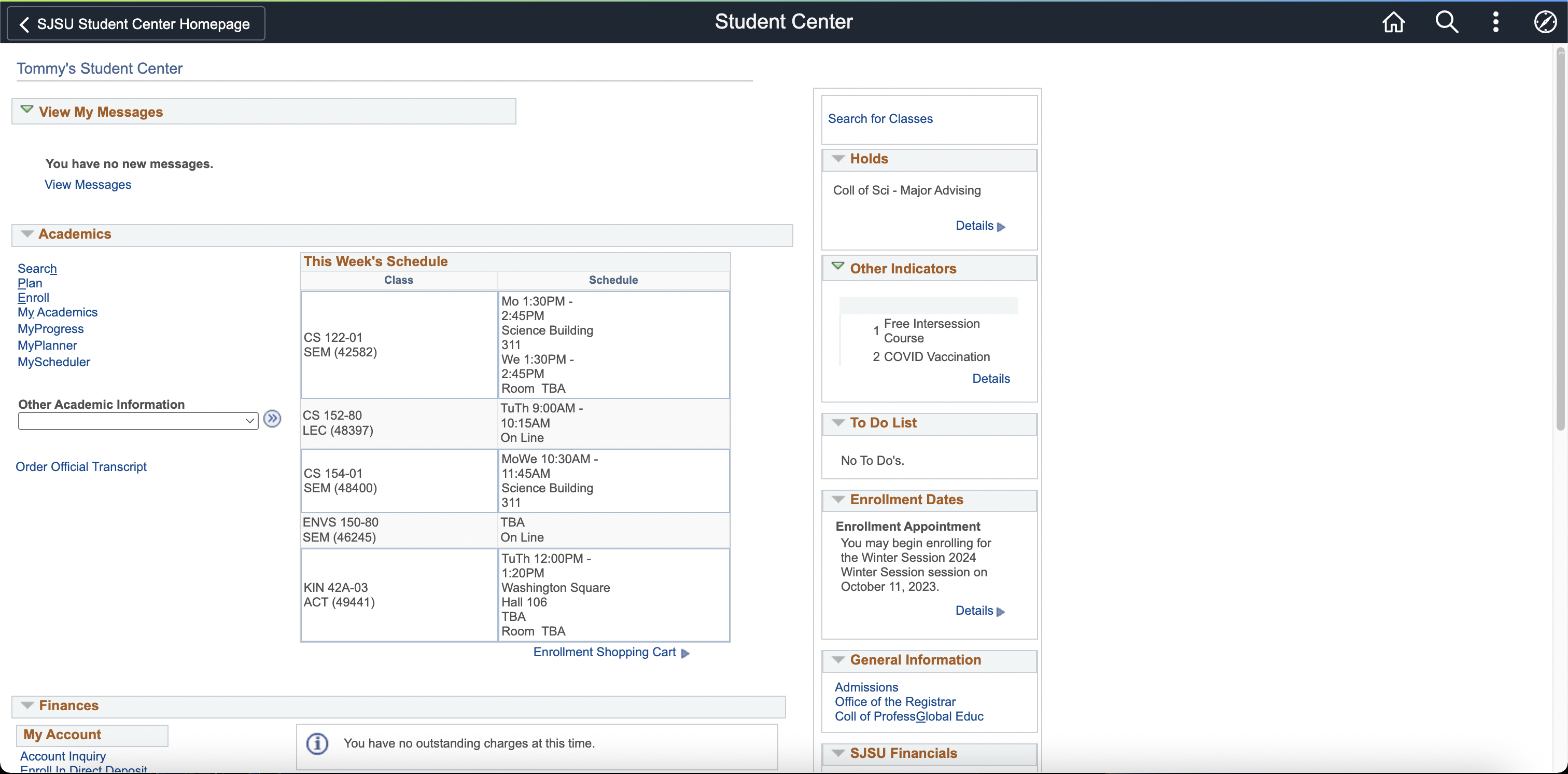
Since I was a freshman, I had always found the the school’s one-for-all student information page (named MySJSU) difficult to navigate. Even as a senior, I still find myself struggling to find certain information because the portal shows too much information at once. MySJSU lacked strong visual direction and the negative space taking up the right side only made the page seem more cluttered. After years of being frustrated with the page, I decided to redesign it.
First, I decided to reach out and see what others thought of MySJSU. While I knew other people struggled with finding what they wanted on MySJSU, I didn't know what exactly were their pain points. I sent out a survey to gather what other students think about MySJSU and how they feel using it. Nine students had responded.
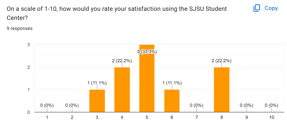
A majority of the answers lay in the center of the scale, indicating that most students feel that MySJSU is
satisfactory, but not completely satisfied with it.
I polled them on which areas of MySJSU they frequently used and found that MyProgress, Messages, and MyScheduler
are the most commonly used on the page.
In the long answer response, it appears that most students would prefer their MySJSU page to be more
straightforward.
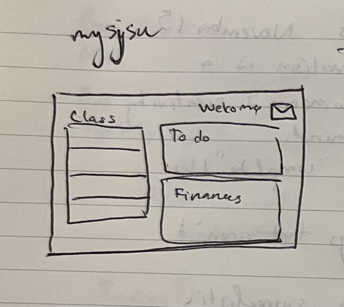
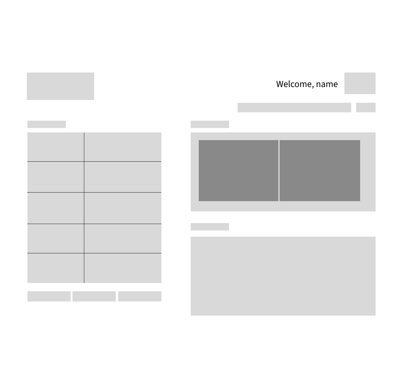
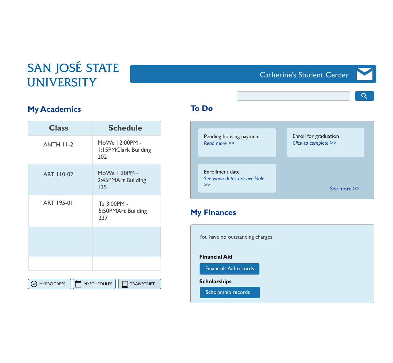
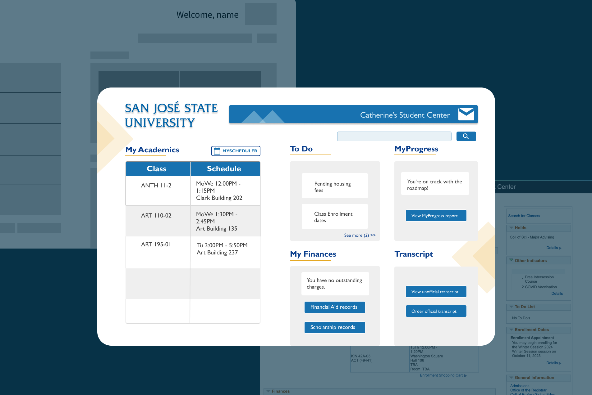
When designing a new mockup for MYSJSU, I decided to break the site down into big shapes, so whatever that fell under one umbrella would be in one place. My main goal was decluttering the links and letting the eye scan over sections quickly.
In Figma, I created the same big shapes for my low fidelity prototypes. When I was satisfied with the sections, I started to expand into my high fidelity prototypes.
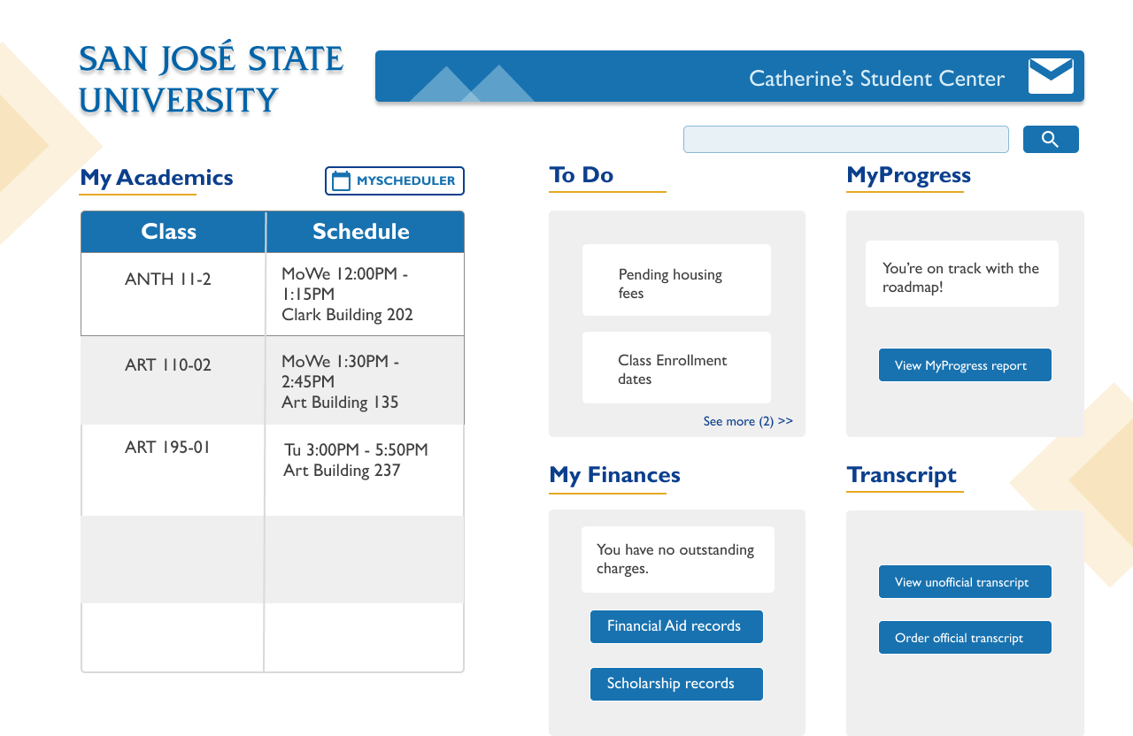
I simplified the overall design, keeping everything into specific sections, allowing the eye to scan
over information quickly. I removed all the links and words for a cleaner interface.
The search bar now is more noticeable and right next to the title of the page, so it would be one of the first
things
the user would look at when the page finished loading. Since students frequently used MyProgress and MyScheuler,
I changed them from simple links to bigger buttons to catch the viewer's eye. My new design also has more
splashes of blue and yellow, the school's colors, because the original design had a lot of gray rectangles which
made it hard to differentiate sections.
When processing my research information, I realized that I neglected the other portions of the student center
that other users might’ve used in my survey. I made a mistake in limiting the choices to only those five tools,
letting my confirmation bias narrow down the other possibilities.
Another thing I realized was that I would’ve liked to see a first-time user try to interact with the old MYSJSU
page because it would’ve shown me the pain points of the old design. As much as I'm proud of my current design,
there is still so much that I have to learn about ux research and I aim to improve with the next case studies.